In other video tutorials, we already explained how to find an indicator in the Data Warehouse, and then download its data into R. This tutorial presents how to draw a basic bar chart with this data.
See the below for more information. Note: Russian subtitles are available for the video.
1. There are many user packages that can draw basic charts in R. This tutorial uses the ggplot2 user package. Make sure that the ggplot2 package is installed in your RStudio and that it is included into your code.
install-packages(“ggplot2”, dependencies = TRUE)
Require(“ggplot2”)
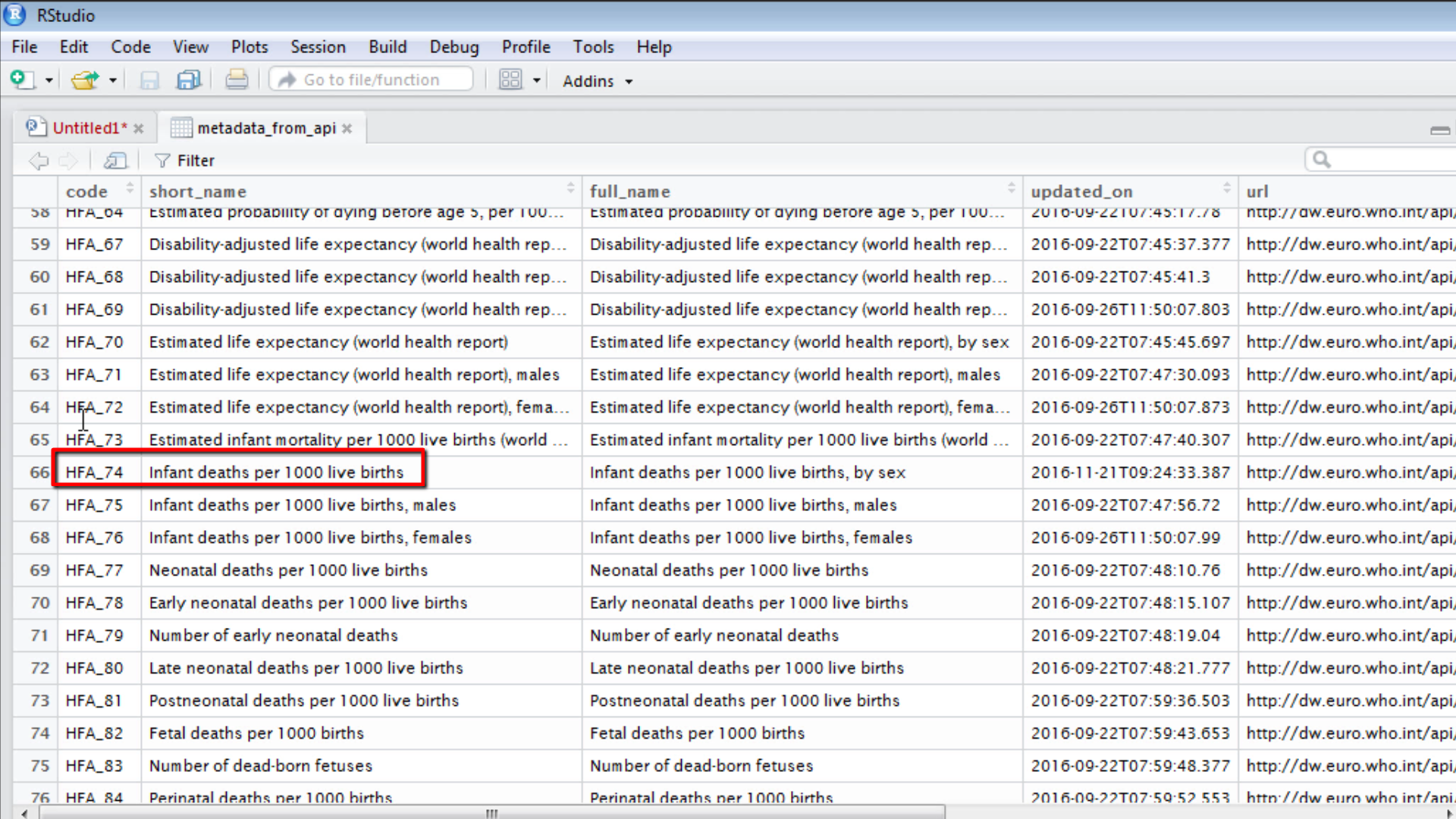
2. One of the previous tutorials shows how to download an indicator’s data from the API. Use those data. Review the data in the data frame named data_from_api. It contains data from the indicator with the unique identifier HFA_74. Take a look at the metadata and notice that the code HFA_74 corresponds to “Infant deaths per 1000 live births”.


3. Make a copy of the data set and call it “barchart” data frame by running the following code.
barchart <- data_from_api
4. When browsing the data frame notice that it contains data for a set of years (1970-2015), for different sexes (all, females, males) and also averages for country groups. These country group values are population weighed subregional averages for a predefined group of countries in the region. When you want to draw data for year 2013, with total population values, and not showing any averages you have to filter the data for only the year 2013. Perform this by running the following code. It should run very fast.
barchart <- barchart [barchart$dimensions$YEAR == 2013,]
barchart <- barchart [barchart$dimensions$SEX == “ALL”,]
barchart <- barchart [barchart$dimensions$COUNTRY != “”2013,]
5. Browse the data, and notice that it contains exactly the information wanted. Once the data is prepared, draw the bar chart. Run this code.
dat <- data.frame(country = barchart$dimensions$COUNTRY,
      values = as.numeric(barchart$value$display))
ggplot(data=dat, aes(x.country, y=values, fill=country)) +
      geom_bar(stat=”identity”) +
      ggtitle(“Infant deaths per 1000 live births”)
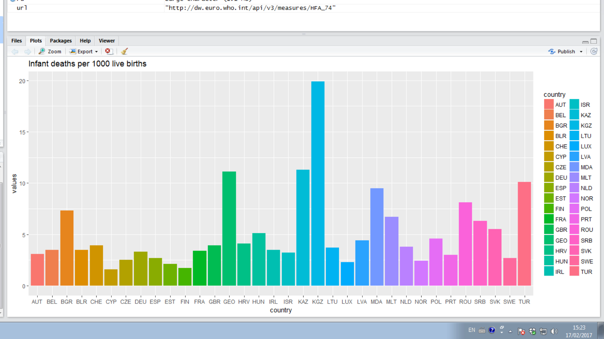
6. The bar chart is displayed in the right-bottom window in the Plots tab. It displays the Infant deaths per 1000 live births among WHO European countries. You can very easily see that the maximum infant death rate in 2013 is about 20 deaths per 1000 live births and the minimum is about 2 deaths per 1000 live births.

7. Applying the usual options of ggplot2 package you can style the colour of bars, display labels on the bars. You can also sort the bars by sorting the underlying dataset. For more information please see the ggplot2 package web site -http://www.ggplot2.org/or you can search for more documentation on internet.
8. You can also export your graph as image or as pdf file. In similar ways, you can load the data from the API, prepare it, and visualize it with your favourite package and graphs. This way you can script to query the Data Warehouse for the latest data and always have it available for your analysis.